IRONORBIT
CLOUD
TECHNOLOGIES
IronOrbit is a cloud technology company. It has been a big part of my daily life for the past six years. I worked on this project in 2021 to refresh the brand. It was affectionately dubbed, “Project Phoenix.”
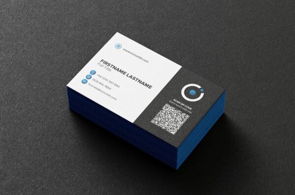
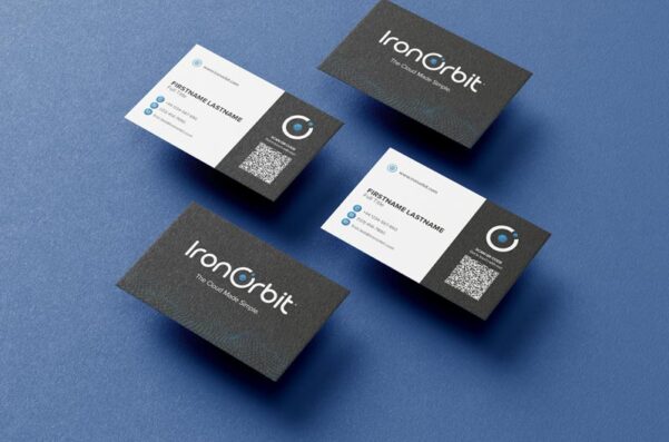
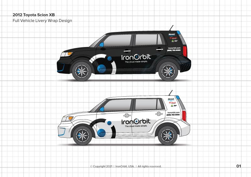
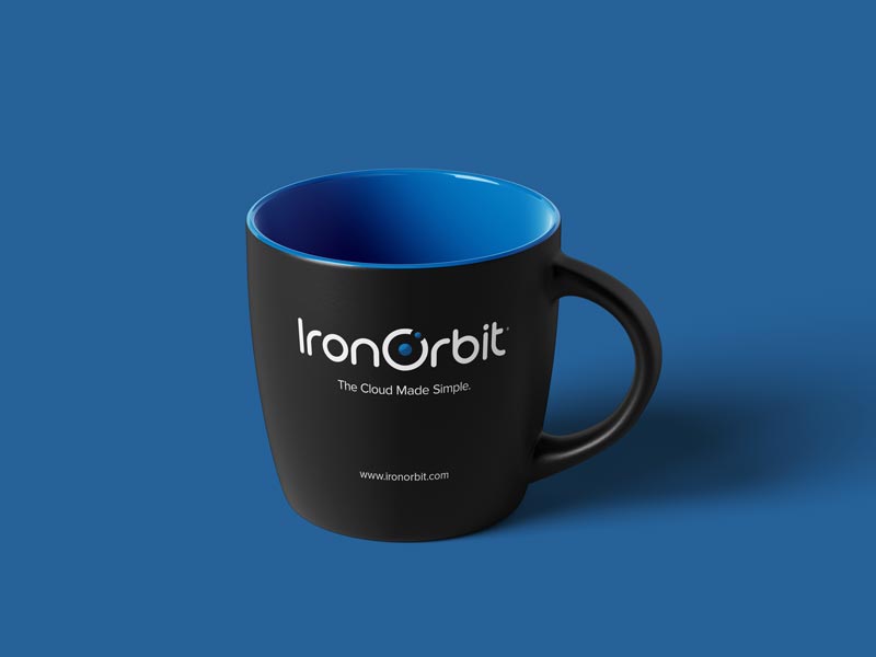
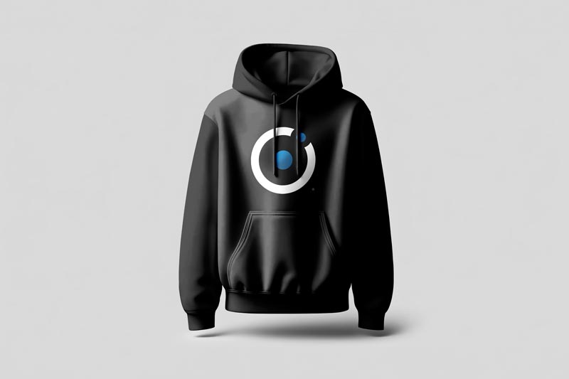
IronOrbit needed a more symmetrical logo and a consistent set of brand guidelines. This included the product suite, stationery, digital channels, vehicle branding, apparel, etc.
BRANDING MADE SIMPLE
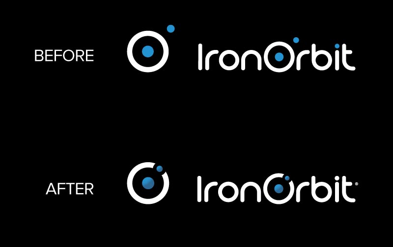
The initial version of the logo had the dot orbiting the outside of the "O," which resulted in multiple alignment issues.
Bringing the orbit inside the "O" makes the brand mark more symmetrical. Additionally, adding a gradient to the dots creates a sense of dimension.

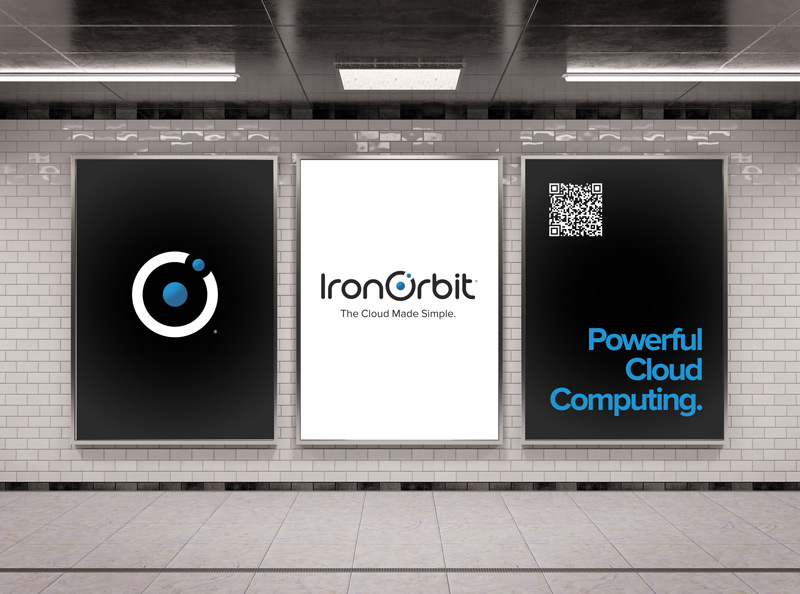
BRAND IN ACTION
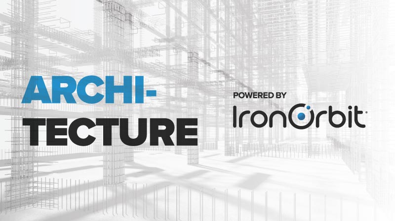
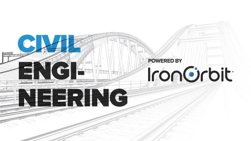
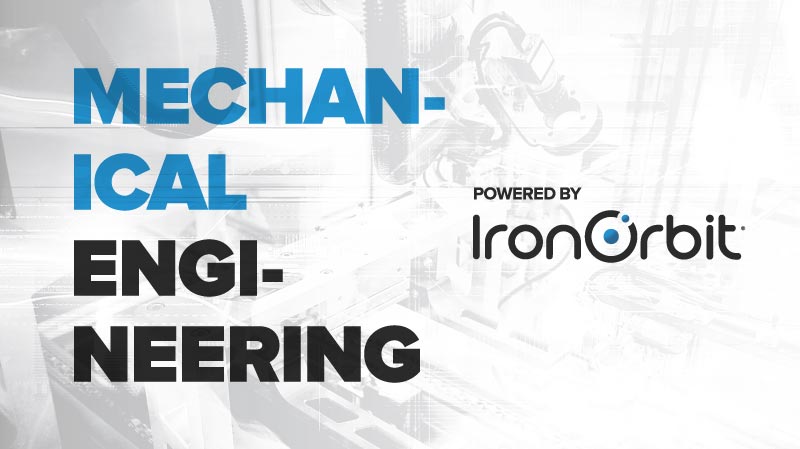
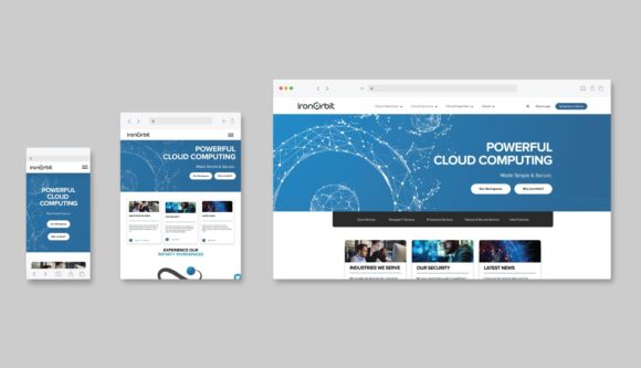
The project involved a complete website redesign. "Powerful Cloud Computing" was used to introduce IronOrbit's primary offering, GPU-Accelerated Cloud Desktops.
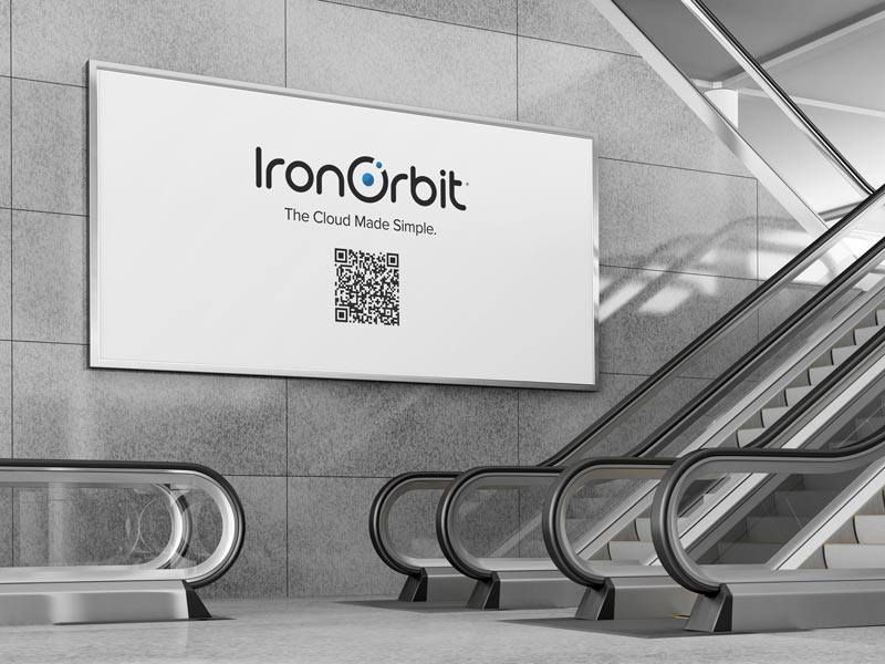
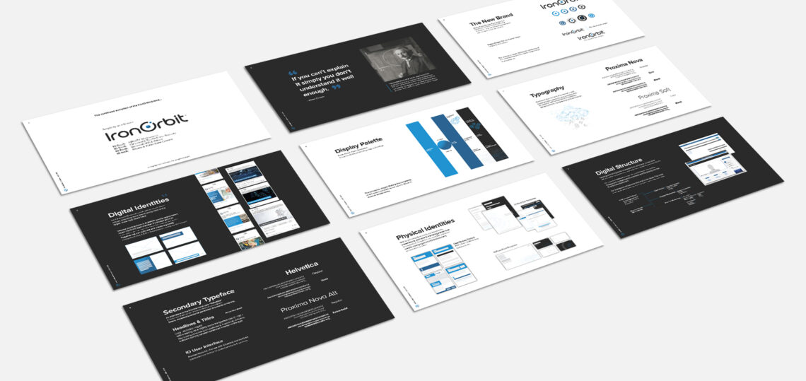
I created a complete set of brand guidelines, which included a social media design and campaign strategy. Every aspect of the brand was modernized and unified.


Social Media Posts and Campaign Examples.